Visualization
Julia has a few packages for visualization, depending on your tastes.
Plots
Plots is probably the most well-known, and also one of the oldest. It provides an abstraction layer and you can select the backend that actually does the plotting. See the backend list here.
When you install Plots it also install GR, which is quite fast and has some decent graphics. GR is the default choice, but if you alternate from it, you can activate it again with gr().
The PyPlot package provides another common backend. It uses Python's matplotlib, which provides very nice graphics, although it is a bit slower than GR. Change to PyPlot using pyplot().
You can also use UnicodePlots for plotting directly into the REPL. Change using unicodeplots().
PlotlyJS is also quite well-liked, because it usually allows some interactivity in the plots. Use plotlyjs() to change.
Some packages are more fickle than others to install. GR, for instance, decided to not work with GitHub Actions for this site. For that reason, I use mostly PyPlot.
Here are some examples with PyPlot. Try them with other backends.
using LinearAlgebra, Plots, Random
pyplot()

Random.seed!(0)
n = 100
x = range(-1, 1, length=n)
y = 5 * exp.(-10x.^2) + x + 0.2 * randn(n)
Etr, Ete = Float64[], Float64[]
Ite = shuffle(1:n)[1:2 * div(n, 5)]
Itr = setdiff(1:n, Ite)
pmax = 6
plt = plot(title="ML stuff", layout=grid(1, 2), size=(800,400))
scatter!(plt[1], x, y, leg=false)
for p = 1:pmax
  X = [x[i]^j for i = 1:n, j = 0:p]
  β = X[Itr,:] \ y[Itr]
  plot!(plt[1], t -> β[1] + sum(β[j+1] * t^j for j = 1:p), -1, 1)
  r = y - X * β
  push!(Etr, norm(r[Itr])^2 / length(Itr))
  push!(Ete, norm(r[Ite])^2 / length(Ite))
end
plot!(title="MSE")
plot!(plt[2], Etr, m=(3,:blue,:square), lab="Train")
plot!(plt[2], Ete, m=(3,:red,:circle), lab="Test")
png(joinpath(@OUTPUT, "vis-plots-1"))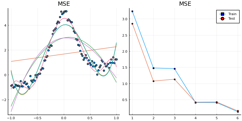
X = [
  0.4 * randn(div(n, 2), 2) .+ 3;
  1.2 * randn(div(n, 2), 2) .- 1;
]
h = 1.0
K(x) = exp(-norm(x)^2 / h) / h
f(x) = sum(K(x - X[i,:]) for i = 1:n) / n

plt = plot(layout=grid(2,2), leg=false)
scatter!(plt[1], X[:,1], X[:,2], title="scatter")
contour!(plt[2], -5:0.1:5, -5:0.1:5, (x,y) -> f([x;y]), title="countour", levels=50)
surface!(plt[3], -5:0.1:5, -5:0.1:5, (x,y) -> f([x;y]), title="surface")
surface!(plt[4], -5:0.1:5, -5:0.1:5, (x,y) -> f([x;y]), title="surface", camera=(70,10))
plt
png(joinpath(@OUTPUT, "vis-plots-2"))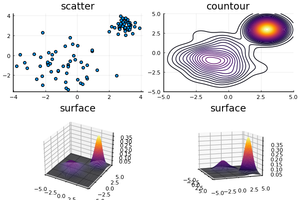
θg = range(0, 2π, length=120)
anim = Animation()
n = 3
plot(leg=false, axis=false, grid=false, size=(600,600))
for i = 1:6
  θr = range(0, 2π, length=n + 1)
  plot!(cos.(θr), sin.(θr), c=:blue, opacity=0.5, lw=3)
  radius = 1 / cos(π / n)
  plot!(radius * cos.(θr .+ π / n), radius * sin.(θr .+ π / n), c=:red, opacity=0.5, lw=3)
  xlims!(-2, 2)
  ylims!(-2, 2)
  frame(anim)
  global n = 2n
end

gif(anim, joinpath(@OUTPUT, "vis-plots-anim-1.gif"), fps=1)
Plots.AnimatedGif("/home/runner/work/julia-tutorial-at-nlesc/julia-tutorial-at-nlesc/__site/assets/pages/basics/visualization/code/output/vis-plots-anim-1.gif")
PyPlot
PyPlot uses Python's matplotlib, as said above. We can use it as a backend to Plots, but it can also be used directly. The main advantage are that the syntax is closer to matplotlib's syntax, and Plots doesn't support everything that PyPlot does.
using PyPlot
x = range(0, 2π, length=1000)
y = sin.(3 * x + 4 * cos.(2 * x))
PyPlot.figure()
PyPlot.plot(x, y, color="red", linewidth=2.0, linestyle="--")
PyPlot.title("A sinusoidally modulated sinusoid")
PyPlot.savefig(joinpath(@OUTPUT, "vis-pyplot-1"))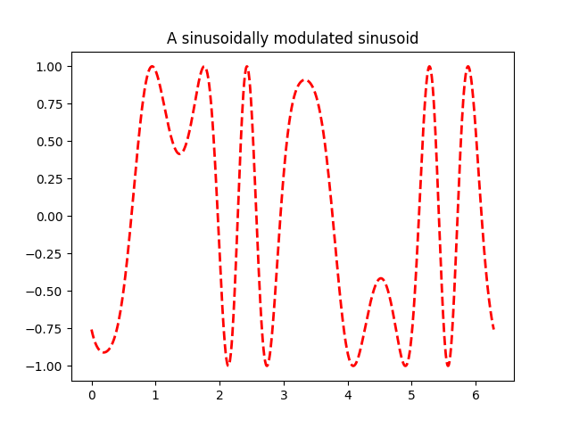
Makie
Makie is a complete alternative to Plots. It tries to achieve high performance using heavier backends, such as OpenGL.
StatsPlots
This package provides "recipes for Plots.jl" - i.e., new plotting functions - for statistical plots.
using RDatasets, StatsPlots

df = dataset("datasets", "iris")
@df df cornerplot(cols(1:4), compact=true)
png(joinpath(@OUTPUT, "vis-statsplots-1"))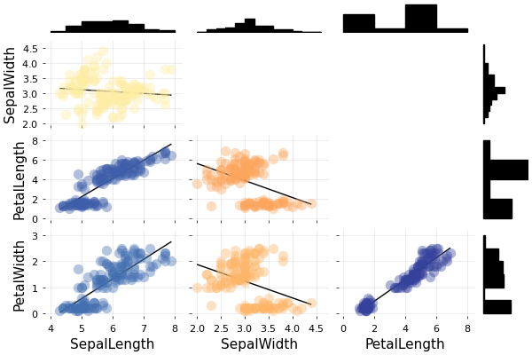
plt = plot(layout=grid(2, 2))
for i = 1:4
  StatsPlots.violin!(plt[i], df.Species, df[!,i], lab="", ylabel=names(df)[i])
  StatsPlots.boxplot!(plt[i], df.Species, df[!,i], lab="", fillalpha=0.6, m=(0))
  StatsPlots.dotplot!(plt[i], df.Species, df[!,i], lab="", m=(:white, 2), opacity=0.6)
end
png(plt, joinpath(@OUTPUT, "vis-statsplots-2"))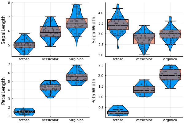
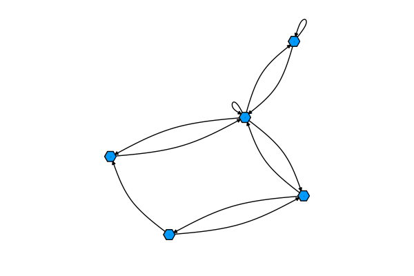
GraphRecipes
Plot recipes for Graphs.
using GraphRecipes
g = rand(0:1, 5, 5)
graphplot(g)
png(joinpath(@OUTPUT, "vis-graphrecipes-1"))